Creating designs for sales vs creating them for Users.
I am saying DON'T BE USER CENTRIC ... (Don't shoot me yet)...for a little while.
We are NOT talking about implementing a design that isn't user-centric. We are just keeping our protagonist on the side for a little while and working on the promo poster of the film.
Thinking about users brings in a lot of clutter.
There are typically a bunch of different things you need to think about:
1. What's the persona: who exactly is using this feature and why?
2. What are they hiring this product/module/feature/screen for?
3. The main flow, additional flows, error flows
4. Some navigation constraints like where are they coming from, and where can they go from here.
5. A few product constraints around what information we traditionally have or do not have
6. A few constraints based on timelines, and scope
7. Finally maybe some constraints based on the technical capabilities
So as a first step, we don't design for the user. We imagine our product already exists and users are using it. We need to simplify and show something that is clearly much simpler and can be used in a print ad or a TV commercial. With 4 out of 5 sponsors of all large tournaments in India being mobile app companies, it's easy to find inspiration for how people simplify their complex user interfaces for showcasing the use case in TVCs.
Example:
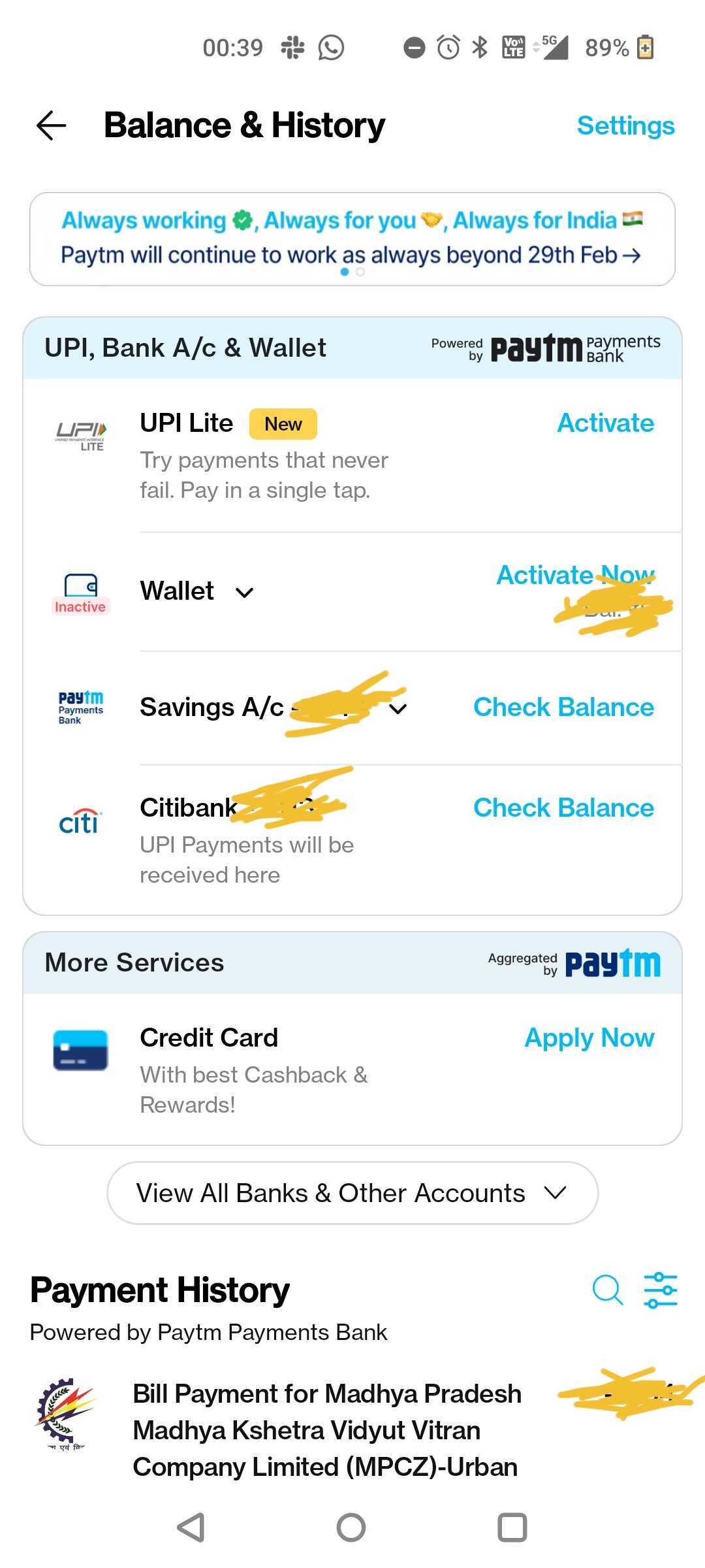
PayTM actual screen v/s the Screen on Ad
 v/s
v/s
When you design for sales, you just want it to have the following:
1. It clearly states the value achieved by the user.
2. It is aesthetically pleasing.
I am not saying these can't be done in a user-centric approach as well. Just that it usually gets lost in the clutter, and what you get is a dull and boring design that functions really well. It's almost like you stack the cans, arrange the snacks, order the food and then forget to party.
Starting by creating for sales helps you create some really great UI, that impresses. In fact, the first version of the product may look completely different from the UI you've created for sales. Well, it's not for the sales team to actually use it (while we do sometimes end up showing it during high-profile deals). It is for the product and design teams to use it for internal selling. We can call it a North Star UI.
How to do it?
What is the final outcome/value achieved by the user?
What will the screen look like, at its glorious best?
What is the most relatable information/term/output on the screen?
What is NOT immediately screaming value?
This has helped.
Try it, and let me know
if you don't find it helpful. :-)
if you don't find it helpful. :-)


